15 Comments
All the Shop Video and Blog Hop


Video Tutorial
My video tutorial above showcases four similar cards I customized to look like my house! One design is a solid house with a pop up mechanism. The other design has a see through element.
Be sure to leave your comment on this video to enter yourself into the prizes!
Card one

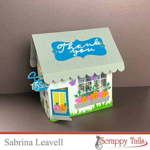
Both of my cards today feature our new "A7 Storefront Pop up" die set. Instead of creating a store, I opted to create a cute citing neighborhood house! I customized each of my cards today to look like the house I'm purchasing for myself (I know SO EXCITING!) I made four total cards; I plan of giving one to my realtor and one to each of my lenders. I will keep one for myself since it is a replica of my house after all!
I think these cards are the perfect customized gift for new homeowners or even realtors looking to purchase cards from you!

Here's a great look at the amazing dimension you can achieve with the "A7 Storefront Pop up" die set. It folds flat and fits inside an A7 envelope. To make it pop out of the envelope, I added our new "A7 Storefront Mechanism" die set to the bottom of the card. This is a fun rubber band mechanism that allows any of your pop up cards to spring right out of the envelope.

If you look closely, you might notice some faint lines on the white card base. These are half inch score lines I added to the bases using my score board. I thought it gave the look of citing.
On the front of this card, I added two windows from the "Neighborhood House Add-on" die set. This die is intended to work with our "Slimline Pop Up Bird House" die set. However, it works great with the storefront too!
The door, street sign, roof, and sign are all included in the "A7 Storefront Pop up" die set. This is a HUGE set, there's even some window options if you don't have the Neighborhood House Add-on.
Below my windows, I added flower boxes with flowers and leaves from our new "A7 Flower Cover Plate" die set. I added some small purple butterflies as well as some grass to the bottom of each of my cards.

The left and right sides of all of my house cards are all decorated the exact same way. I added a rounded rectangle window to the center accented with another flower box and butterflies. The bottom features more grass and a brown siamese cat from our new "Garden Animals" die set. (I had to represent my Felix on these cards, just another cute customized feature!)

The backs of all of my house cards are all decorated the exact same way. I added a yellow label in the center to write a personal message. To the left, I added a sign post where I plan on writing my house street. I added more grass and purple butterflies to coordinate.

Here's a look at the card folded completely flat!
Card Two

Card Two is pretty much the same, I just changed the front of the house slightly. I wanted to create a house where you can see inside the windows and open the front door. To do this, I used the coordinating window and door shadow dies from the "Neighborhood House Add-on" and the "A7 Storefront Pop up" die sets to cut through one of my card bases. Behind the openings, I glued acetate to create the look of glass.

Inside the house I added furniture from our "Home Furnishings" 4x6 stamp set. They're the perfect size for this pop up! I colored each image with my COPIC markers.

Those are my cards today! Let me know which card design you prefer. I hope you have fun on the hop and are inspired by all the amazing card designs. I'll see ya next time!
The next person on the hop is Sharon!

15 Comments
You added SO many fantastic details! Those Siamese kitties are just the cutest!
Beautiful houses! I really love that you added those stamped scenes through the windows and doors! Very cool!
Beautiful cards! I love the mixing of old with new.
Stunning! They are both so pretty I couldn’t possibly pick a fav!
These pop ups are AWESOME! I love the colors! Your flowers are perfect and the sentiments so sweet!!!